How to create a positive first impression on customers? Maybe it goes beyond just the quality of your products or services. It’s largely about your branding. Regardless of the size of your business, a distinctive and memorable brand identity is a game-changer. This is where the brand guideline comes into play. Your brand will stick itself in the minds of the customers as you craft a stunning brand guideline. The unified vision of the brand not only enhances recognition but brings a sense of reliability. In this article, we will explore a selection of brand guideline examples that will inspire you to create your unique brand identity.
1. 9 Amazing Brand Guideline Examples to Spark Your Creativity
(1) Twitch
Twitch’s brand guideline is as colorful and lively as the multiplayer it serves. It gives priority to its logo which is the the most recognizable element of the brand. The brand guideline example also describes the use of Twitch’s color palette, typography, and brand voice.
(2) Dropbox
Glyph, typography, and even sample banner design appear in Dropbox’s brand guideline PDF. It illustrates the logo placement and the incorrect usage of its logo. Dropbox’s color palette consists of 18 colors while other companies focus heavily on logo variation, allowing for more creative and vibrant color combinations for its logo design.
(3) Spread Truth
The brand guideline PDF aims to create a consistent tone, look, and feel for Spread Truth. You can find a set of rules for its visual communication system, including logos, typefaces, colors, and more elements. The imagery showcased in the brand guideline content shows the relational aspect of the Spread Truth.
(4) TikTok for Business
TikTok for Business is a platform for advertisers developed by TikTok, one of the most popular social media apps for short-form mobile video. The brand guideline example is thorough, encompassing brand messaging, design system, imagery, and advertising guidelines. When it comes to logo, typography, color, and design toolkit, the guideline lists things to avoid, thus establishing a unified standard for the brand’s visual representation. After obtaining the permissions, you can download its logo files, typefaces, color palette, and toolkit illustrator files.
(5) Adobe
Adobe is one of the world’s leading software companies, so it’s no surprise that its brand guideline is extremely comprehensive. It begins its brand guideline content with a brief introduction of its mission, values, and personality tenets. Only then does it delve into its logo, visual identity, corporate templates, and editorial guidelines.
(6) Slack
Slack defines its brand by demonstrating its values, personality, and brand voice. There is much information about visual design elements laid out in its brand guideline PDF, like octothorpe, logo, typography, icons, and photography.
(7) Spotify
The brand guideline PDF of Spotify is divided into two parts: logotype and partner messaging. Its primary logotype is a critical graphic element and provides a straightforward way to identify its brand visually. To maintain its brand consistency, Spotify highlights how to use its logo and how to communicate under different circumstances.
(8) Olympic Games Paris 2024
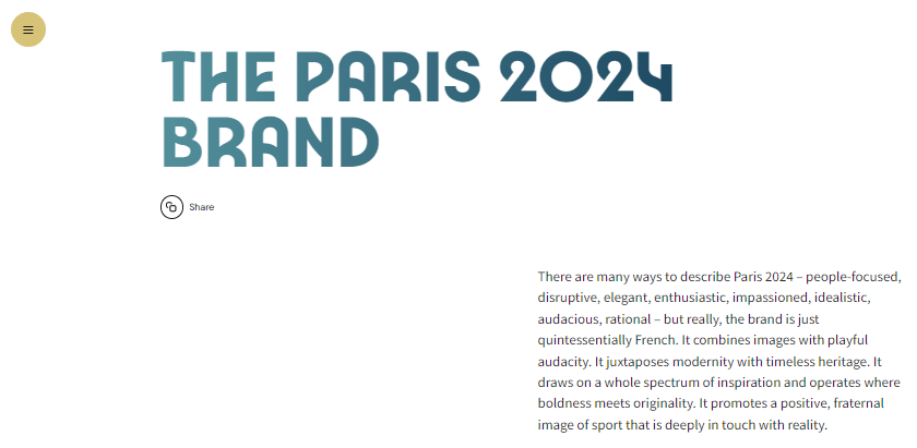
Paris 2024 pays tribute to the 1924 Games and features a spectrum of inspiration. The brand guideline example details 5 design elements, including the iconic emblem, typography, color scheme, iconography, and arch. It also displays ten institutional brands to extend the reach of the Games.

(9) Snapchat
Snapchat builds the brand guideline to specify the do’s and don’ts of using its brand elements to present its brand in a consistent manner. Its ghost logo and Snap yellow color are the distinct brand elements that set it apart from other apps, so these two elements can not be altered in any way.
2. 4 Essential Elements to Include in A Brand Guideline
A compelling brand guideline incorporates much more than just a logo. Keep reading to learn 4 important elements that should be integrated into your brand guideline content.
(1) Logo
The logo is an integral part of the brand guideline. Add a visual image of your logo and explain its design details. By illustrating its proper usage and common mistakes, you can ensure the consistent application of your logo in any case.
(2) Color Palette
Color is one of the most recognizable parts of the brand guideline that reflects the aesthetic and unique style of your brand, and fosters strong emotional connections with the audience. Create multiple versions of your color palette and establish the rules for when to use them, preventing incorrect application of colors.
(3) Typography
Typography is the art of arranging letters and typing in a legible and visually appealing way. As your brand guideline is designed to give specific instructions related to the elements of visual identity, we recommend providing a variety of font options for different use cases.
(4) Brand Voice
Brand voice is how the audience perceives your brand. Its importance can’t be underestimated. Establishing a consistent brand voice makes it easy for your designers, marketers, and anyone else working with the brand to represent your brand to the public accurately and effectively, maintaining brand integrity across all touchpoints.
Conclusion
Having delved into a list of brand guideline examples and the 4 vital elements of brand guideline content, do you feel inspired? If you are looking to create your brand guideline seamlessly and efficiently, Flip PDF Plus Pro is an ideal solution. This intuitive tool converts your brand guideline PDF into an interactive flipbook within minutes. It offers you powerful features to streamline your entire workflow and craft an engaging brand guideline in a breeze. Start to bring your brand to life right now!
Convert Your PDF to A Flipbook Easily