Are you thinking out of the box? How about creating an enticing travel brochure for the free-spirited wanderers instead of taking risks in messing up with your existing website just to include more information through the inclusion of scores of pages. In case you are not aware, a well-designed brochure sure does have a lot of potential to grab the attention of readers and encourage them to fantasize about the exotic locations in the subject.
The Guide to Creating a Travel Brochure
Here’s how you can get started and motivate readers to book a travel package with your company.
Part I: Collect every bit of detail for your travel brochure
Before jumping off to a start, take some time off from your busy schedule to jot down a few things:
- Location of your choice
- Invest some time in R&D to recognize the key highlights of that location
- Take the assistance of Google Maps to locate amenities around
- Search for reviews either by questioning people who live nearby or browsing internet sites to look for the same
- Decide on your target audience by picking up a demographic group. Just in case you are seeking ideas, aged people fancy vacation spots with restaurants and bathrooms, while youngsters crave non-residential spots. For kids, on the contrary, fully furnished hotels with facilities like Wi-Fi and cable work wonders!
- Set a standard price for your travel package by considering each of the amenities and features along with its cost.
Part II: Pen down the content for your travel brochure
Convincing content with a captivating title acts as a perfect head-turner, so follow the points to come up with a preliminary outline.
1. Start with an argument stating why the vacation spot’s worth your investment and check for edits
2. Play with diverse font sizes and styles to come up with a perfect one, which is legible from a distance
3. Ensure consistency in font style throughout the text but separate headings from sub-headings by adjusting the font size. The motive is to maintain a nice flow that wouldn’t bog down the reader in any way.
4. Include in the title fanciful adjectives like ‘breathtaking’, ‘pulsating’ etc to catch one’s attention and incorporate the location just after the adjective.
5. Apart from putting it in bold and underlining it, one has to end the title with an exclamation mark to make it sell.
6. Give prominence to the opening line and include a list of hot spots in it.
7. Since a brochure is not entirely based on text but contains visuals as well, divide the content into 6-8 sections and intimate customers in 3-4 lines about the four diverse aspects- scenery, restaurants, shops, and hotels.
8. Highlight the specialties like accessibility for handicaps, complimentary breakfasts, and other distinguishing aspects.
9. Edit client testimonials by keeping them enclosed within quotation marks, indenting them, and sharing the most sensitive yet valuable information.
10. Include an all-encompassing price section as given below.
Use simplified texts such as “huge discounts for purchasers ordering via phone” and finish it in 3-4 sentences. The motto is to shed light on deals and discounts. Make sure you include the same inside the pamphlet.
11. Entice readers into visiting your website or reaching you through calls/emails. It is better to point out the addresses at the back of the brochure or right after the price section.
Part III: Enrich your travel brochure to wow readers
Since a marketing brochure is a perfect balance of images and write-ups, it’s time you work on the visuals right after jotting down your scheme. Here’s how you may proceed:
1. Narrow down to intriguing visuals, rich in color and of high resolution.
2. Skip stock photos that look somewhat fake and replace them with realistic ones, showcasing glimpses of happy moments.
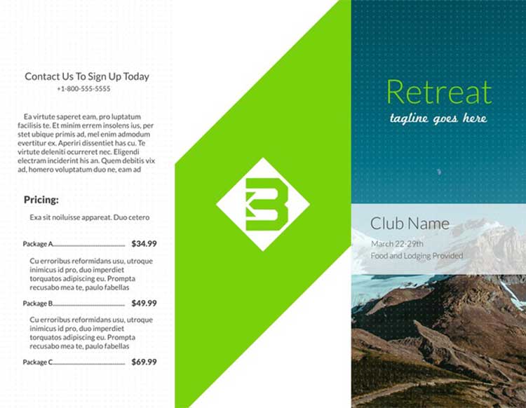
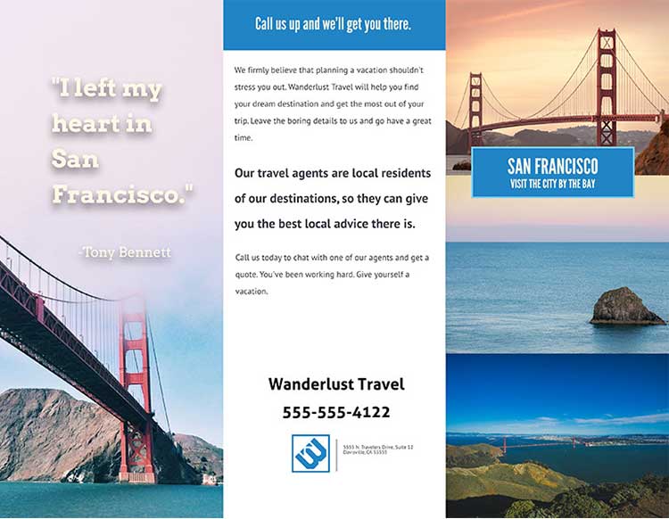
3. Choose the color scheme wisely, sticking to bright ones for children’s destinations, and pastel tones to convey a relaxed feel and antique touch to historical locations like the following picture illustrated below.
4. Invest some more time into designing it by bordering the template with a thin line of a shade slightly brighter/pale than the underlying tone.
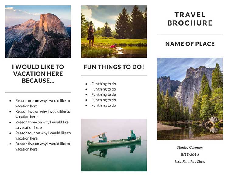
5. Make use of 3-4 asterisks/bullets to define key aspects but in a controlled way as depicted in the picture below.
6. Ensure a perfect harmony between visuals and the key points listed in the brochure
7. Finally, approach a professional print company to reproduce the hard copy of the brochure on high-quality, thick-coated paper.
8. Proofread the content and check on the design/layout to confirm it.
Conclusion
The step-by-step procedure involved might seem elaborate but the outcome is propitious. Follow them to start from a blank page or a ready-made travel brochure template. After the creation, upgrade your brochure with a top-tier travel brochure maker – Flip PDF Plus Pro. The latter promises a media-rich brochure, scoring high in aesthetic look to provide users with a responsive experience through a page-flipping style digital travel brochure. The breathtaking view of tourist destinations presented in the digital travel brochures will attract more travelers. Get a free trial of Flip PDF Plus Pro to unleash your creativity.
Convert Your PDF to A Flipbook Easily


