Design tokens for digital publishers turn brand and interface decisions into reusable values that can travel across articles, flipbooks, landing pages, newsletters, social images, and campaign assets. Instead of asking every editor, designer, and marketer to remember the right color, type scale, button style, spacing rule, or image treatment, the team works from a shared system.
That matters because digital publishing is now multi-surface by default. One story may appear as a web article, embedded flipbook, email feature, product guide, downloadable resource, and sales enablement asset. If each version is assembled by hand, visual drift and production rework are almost guaranteed. Design tokens reduce that drift without forcing every page to look identical.
Key takeaways
- Design tokens translate brand decisions into practical publishing rules for color, type, spacing, imagery, and components.
- A small token system can support 5 common surfaces: articles, flipbooks, newsletters, landing pages, and social previews.
- Tokens help non-design teams make consistent choices without waiting for a designer to review every minor layout decision.
- Publishing tokens should include accessibility notes, not only visual preferences.
- The best rollout starts with high-repeat assets such as article templates, cover images, CTA blocks, and newsletter modules.
目次
- What design tokens mean in publishing
- Why publishing teams need them
- Build a practical token library
- Connect tokens to publishing workflows
- Governance without bottlenecks
- Design token rollout checklist
What design tokens mean in publishing
A design token is a named value that represents a design decision. In software teams, tokens often store colors, font sizes, spacing units, border styles, and component states. For digital publishers, the same idea can be expanded into editorial production: approved headline scales, cover-image crops, caption styles, pull-quote treatments, table spacing, link styling, button labels, and content-card rules.
The point is not to make every article rigid. The point is to remove recurring guesswork. A token named article-heading-large is easier to reuse than a loose instruction such as “make this heading feel important.” A token named newsletter-cta-primary is clearer than rebuilding a call-to-action block from memory every week.
Why publishing teams need them
Publishing teams usually operate across multiple roles and tools. Editors work in the CMS. Designers create feature images and flipbook covers. Marketers build campaign pages. SEO owners adjust metadata and internal links. Freelancers may contribute assets from outside the core team. Without a shared design language, each handoff introduces small inconsistencies.
Those inconsistencies are not just cosmetic. A CTA may become harder to notice. A newsletter module may no longer match the landing page it promotes. A flipbook cover may use a retired brand color. A table may become difficult to scan on mobile. A screenshot may lose the caption style that helps readers understand it quickly.
Design tokens help by making consistency operational. They give teams a controlled vocabulary for common choices and a faster way to produce assets that feel connected.
Build a practical token library
Start small. A publishing token library does not need hundreds of variables on day one. Begin with the decisions that appear most often and cause the most rework.
| Token group | What to define | Publishing example |
|---|---|---|
| Color | Brand, accent, background, alert, and link colors | Consistent article links and flipbook cover accents |
| タイポグラフィ | Heading scale, body text, captions, labels, and quotes | Reusable article templates and newsletter modules |
| Spacing | Section gaps, image margins, table padding, and card density | Readable long-form guides on desktop and mobile |
| Components | CTA blocks, author boxes, content cards, alerts, and FAQs | Repeatable conversion paths across content hubs |
| Media | Image ratios, safe zones, caption rules, and alt-text prompts | Cleaner featured images, social previews, and inline graphics |
Each token should have a name, value, use case, owner, and status. Status matters because publishing systems change. Teams need to know whether a token is approved, experimental, deprecated, or reserved for a specific campaign.
Connect tokens to publishing workflows
Tokens only work when they show up where people actually publish. If the token library lives in a design file nobody opens, it will not change daily behavior. Connect tokens to article templates, CMS blocks, flipbook cover templates, newsletter builders, image-export presets, and campaign landing-page modules.
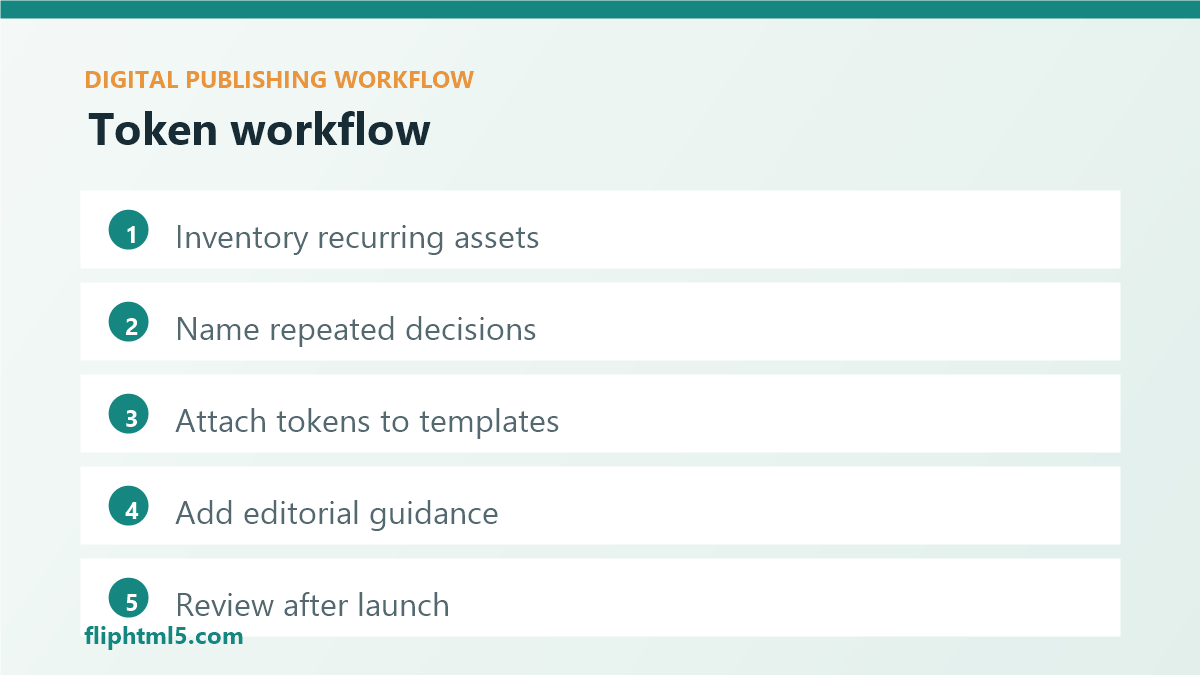
- Inventory recurring assets: list the article formats, flipbook covers, email modules, social previews, and landing-page sections that appear every month.
- Name the decisions: turn repeated choices into clear token names instead of informal visual instructions.
- Attach tokens to templates: update CMS blocks, image templates, and layout patterns so the correct values appear by default.
- Add editorial guidance: explain when to use each token, when not to use it, and what reader problem it solves.
- Review after publication: check whether the tokens improved speed, consistency, readability, and conversion paths.
For teams using a デジタル出版プラットフォーム or a コンテンツ公開プラットフォーム, this workflow is especially useful because one visual system can support online magazines, product catalogs, resource hubs, and campaign assets without rebuilding the look from scratch.
Governance without bottlenecks
A token system should make publishing faster, not slower. Avoid turning every design choice into an approval request. Instead, separate stable tokens from flexible zones. Stable tokens protect brand, accessibility, and navigation patterns. Flexible zones give editors and designers room to adapt the presentation to the story.
For example, headline type, link color, button contrast, and caption structure may be stable. Illustration style, image selection, pull-quote placement, and campaign-specific accents may remain flexible. This distinction keeps the system useful for daily production while still protecting reader experience.
Governance also needs a cleanup path. Retire tokens that no longer match the brand, merge duplicates, and document why a token changed. A simple quarterly review is often enough for a small publishing team. Larger teams can review tokens whenever a major template, brand, CMS, or accessibility standard changes.
Design token rollout checklist
Use this checklist before introducing design tokens across a publishing workflow:
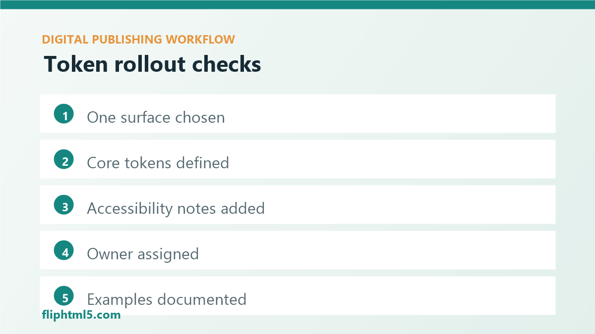
- Pick one high-repeat surface: start with article templates, flipbook covers, newsletter modules, or landing-page CTA blocks.
- Define 10 to 20 core tokens: cover colors, typography, spacing, image ratios, and CTA treatments before expanding.
- Add accessibility context: include contrast expectations, readable type sizes, alt-text prompts, and mobile-safe spacing.
- Assign ownership: name the role responsible for approving, changing, and retiring tokens.
- Document examples: show approved and discouraged uses so contributors can apply the system without guessing.
- Measure adoption: review whether templates are easier to use and whether published assets look more consistent.
避けるべきよくある間違い
- Starting too broad: a giant token library is harder to adopt than a focused set tied to real publishing tasks.
- Using technical names only: editors need human-readable names and examples, not just variables.
- Ignoring mobile layouts: a token that works on a desktop landing page may fail inside a narrow article view.
- Separating tokens from templates: the system should appear in the tools contributors already use.
- Skipping retirement rules: old tokens should be marked clearly so outdated styles do not keep resurfacing.
よくある質問
What are design tokens in digital publishing?
Design tokens in digital publishing are named values and rules that define reusable visual decisions such as colors, typography, spacing, image ratios, CTA styles, and content modules. They help teams create consistent articles, flipbooks, newsletters, and campaign assets across different tools and channels.
Do publishers need a developer to use design tokens?
Not always. Developers may be needed to connect tokens to a CMS or design system, but publishers can start with shared templates, naming rules, image presets, and documented component examples. The important step is making approved choices reusable where contributors create content.
How many design tokens should a publishing team start with?
A small team can start with 10 to 20 core tokens covering brand colors, headline styles, body text, spacing, image ratios, captions, and CTA blocks. Add more only when a repeated publishing decision creates visible inconsistency or slows production.
結論
Design tokens for digital publishers create a practical bridge between brand strategy and daily production. When colors, type, spacing, media rules, and components are named, documented, and connected to templates, teams can publish faster while keeping articles, flipbooks, newsletters, and campaign assets visually coherent.