
Interactive reading experiences turn a digital publication from a static page into a guided exchange: readers can answer a quick poll, expand a definition, save a section, test their understanding, or jump to the next useful resource without leaving the article. The goal is not to decorate content with widgets. The goal is to help readers make progress and help publishers learn what actually works.
For digital publishing teams, the best interactive elements are small, purposeful, and measurable. They should clarify the story, reduce friction, or invite a relevant next action. If a widget does not improve comprehension, navigation, retention, or conversion, it is probably noise.
- Use interaction to support the reader’s job, not to interrupt it.
- Place widgets at natural decision points: after a section, before a comparison, or beside a complex idea.
- Track both engagement and quality signals, including completion, usefulness, and downstream action.
- Keep every widget accessible, fast, optional, and easy to dismiss.
What interactive reading experiences are
An interactive reading experience is a content page or digital publication that lets the reader participate in the flow of information. Common examples include polls, quizzes, calculators, expandable notes, comparison toggles, embedded videos, personalization prompts, saved pages, and guided recommendations.
The difference between a useful interaction and a gimmick is editorial purpose. A quiz after a technical section can confirm understanding. A poll can collect preference data before a buying guide. A calculator can turn a general claim into a reader-specific estimate. A save button can help long-form readers return to a useful page later.
This approach fits especially well for digital magazines, flipbooks, catalogs, training materials, reports, and knowledge hubs because those formats often contain multiple reader paths. The interactive layer helps readers choose a path without forcing every visitor through the same linear experience.
Why engagement widgets matter for digital publishing
Publishers already measure pageviews, time on page, and clicks. Those numbers are useful, but they do not always explain whether a reader found the content helpful. Interactive widgets add more specific signals: which question made readers pause, which recommendation they chose, where they saved the article, or which section triggered a next action.
Google’s guidance on helpful, people-first content reinforces the same principle: content should serve real readers first. Interactive features should therefore make the page more useful before they serve a marketing goal.
There is also a usability case. Nielsen Norman Group’s explanation of progressive disclosure describes a pattern where advanced information appears when it is needed. Digital publishers can apply that idea by hiding secondary details behind expandable sections, glossary prompts, or optional deep dives instead of overwhelming the first screen.
Five widgets that usually earn their space
1. One-question polls
A single poll works well when the article asks readers to compare priorities, choose a challenge, or signal intent. Keep it to one question and 3 to 5 answer choices. Place it after the section that gives readers enough context to answer thoughtfully.
2. Knowledge checks
Short quizzes are useful in training content, product education, and technical explainers. A 3-question knowledge check can show whether readers understood the core idea before they move to the next step. Avoid scoring language that feels punitive; use the result to recommend a section or resource.
3. Expandable explainers
Glossaries, definitions, and expert notes are ideal for expandable panels. They support novice readers without slowing down advanced readers. This is especially helpful for B2B publishing, software documentation, and reports with specialized terminology.
4. Save-for-later actions
Long digital publications often contain practical sections readers want to revisit. Save buttons on chapters, examples, templates, and checklists turn a long read into a working reference. The signal also tells editors which sections have durable value.
5. Contextual next steps
Instead of placing the same call to action at the bottom of every article, use contextual prompts. A reader who finishes a strategy section may need a checklist. A reader who completes a product comparison may need a demo, template, or pricing guide.
A practical workflow for adding interaction
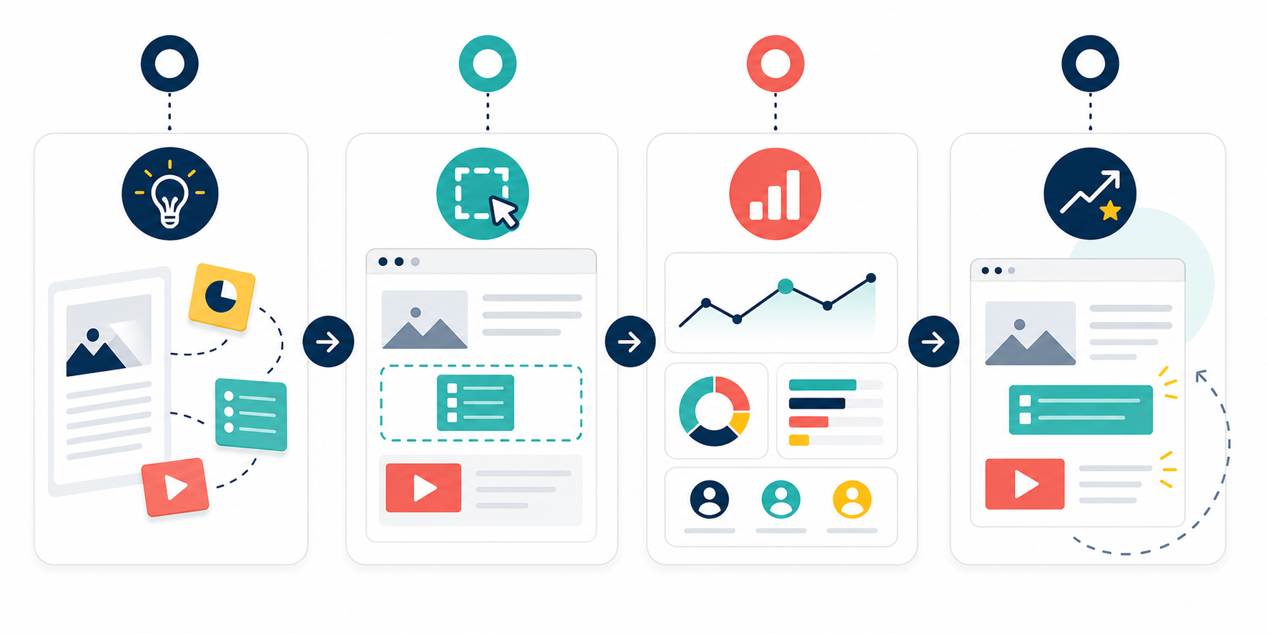
Interactive publishing works best as an editorial workflow, not a last-minute design task. Use this 4-step process:
- Plan the reader decision. Identify the exact moment where a reader needs to choose, confirm, save, compare, or continue.
- Place one focused widget. Add the smallest interaction that supports that decision. Avoid stacking multiple widgets in one section.
- Measure the quality signal. Track completion, response rate, skip rate, assisted clicks, and follow-up behavior.
- Improve the article. Use the data to clarify headings, move explanations earlier, remove weak prompts, or create better next-step content.
A simple rule helps: add one interactive element per major reader decision, not one per screen. Most articles need 1 to 3 strong interactions, not 8 decorative features.
Metrics that separate signal from vanity
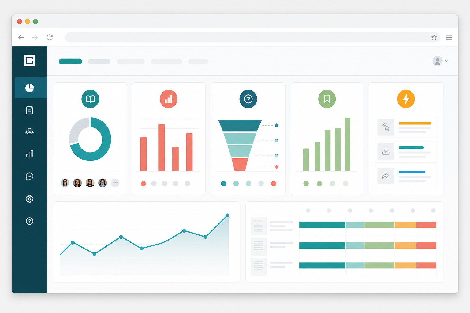
Do not judge interactive reading experiences only by clicks. A high click rate can mean curiosity, confusion, or accidental taps. Pair interaction data with quality signals:
| Metric | What it tells you | How to use it |
|---|---|---|
| Widget completion rate | Whether readers finish the interaction | Simplify or move widgets with low completion |
| Skip rate | Whether the prompt feels optional or irrelevant | Check placement, wording, and value |
| Section completion | Whether interaction disrupts reading flow | Remove widgets that cause drop-off |
| Saved sections | Which content has reusable value | Turn saved material into templates or hubs |
| Next-action clicks | Whether the widget helps readers continue | Improve recommendations and internal links |
Accessibility and performance checks
Every interactive element should be usable by readers who navigate with a keyboard, screen reader, mobile device, or slower connection. The Web Content Accessibility Guidelines 2.2 are the right baseline for planning accessible controls, status messages, focus states, and alternatives.
Before publishing, test each widget against this checklist:
- Can readers use it with keyboard navigation?
- Does it have a clear label, state, and result message?
- Can readers skip it without losing access to the article?
- Does the page remain readable if scripts fail?
- Does the interaction load quickly on mobile?
- Is any collected data explained in plain language?
Performance matters because interactive layers often add JavaScript, tracking, embeds, and third-party requests. If a widget slows down the first meaningful read, it can hurt the experience it was meant to improve.
How this connects to SEO and content strategy
Interactive content can support SEO when it improves usefulness, structure, and internal navigation. It can also create richer source material for future updates: poll responses can reveal reader questions, quiz results can show confusing sections, and save data can identify evergreen assets.
For a broader publishing workflow, connect interactive experiences with related practices such as content operations scorecards, content refresh planning, e search-ready flipbook landing pages. The same data that improves one article can guide a better archive, landing page, or reader journey.
Frequently asked questions
What is the best interactive element for a digital publication?
The best interactive element is the one that helps the reader make progress at a specific moment. For many articles, that is a simple poll, checklist, expandable explainer, or save-for-later action. Start small, measure behavior, and expand only when the data shows real value.
Do interactive widgets help SEO?
Interactive widgets can help SEO indirectly when they improve usefulness, navigation, and reader satisfaction. They should not replace strong headings, clear answers, fast loading, or accessible content. Treat interaction as a reader experience layer, not a shortcut around content quality.
How many interactive features should one article include?
Most editorial articles need 1 to 3 interactive features. A long guide, report, or digital flipbook may support more, but each widget should match a reader decision point. Too many prompts can make the page feel like a survey instead of a publication.
Conclusione
Interactive reading experiences work when they make digital publications easier to understand, remember, and act on. Start with one reader problem, choose one focused widget, measure the quality of the interaction, and use the result to improve the article. That is how engagement becomes editorial intelligence instead of decoration.
Next step: review one high-value article or flipbook and mark 3 moments where readers need to choose, compare, save, or continue. Those are your best candidates for meaningful interaction.