
Reader experience QA for digital editions is the final pass that asks a simple question: can a real person open, read, navigate, trust, and act on this publication without friction? Many publishing teams already check spelling, metadata, image sizes, and links. Fewer teams test the whole reader journey from first click to final call to action.
That gap matters. A digital edition may look finished inside the production tool but still feel awkward to readers on a phone, inside an email browser, through a social preview, or from a search result. A broken table of contents, cramped mobile caption, missing alt text, confusing download button, or untracked campaign link can weaken the entire launch. Reader experience QA turns those risks into a short, repeatable checklist.
Βασικά σημεία
- Reader experience QA reviews the complete journey, not only the article body or flipbook file.
- The best checks cover navigation, mobile readability, accessibility, visual context, analytics, and conversion paths.
- Digital publishers should test from likely entry points such as search, newsletter, social, landing pages, and embedded editions.
- A tiered checklist keeps review practical for daily posts, major guides, product catalogs, and high-value campaigns.
- QA notes should feed back into templates so the same issue does not appear in every new edition.
Πίνακας περιεχομένων
- Why reader experience QA matters
- Map the reader journey before testing
- Test navigation and structure
- Review mobile and accessibility
- Check trust and conversion paths
- Make QA repeatable
Why reader experience QA matters
Digital editions often pass through several hands before publication. Editors refine the message, designers prepare visuals, marketers set campaign links, SEO owners shape metadata, and product teams may embed the final asset in a resource hub. Each step can be correct on its own while the combined experience still feels inconsistent.
Reader experience QA catches the issues that appear only when everything is assembled. Does the headline promise match the first section? Does the cover image still make sense in a small social card? Can readers jump to the right section? Are screenshots still legible on mobile? Does the primary call to action appear after the reader has enough context?
The goal is not perfection. The goal is to remove avoidable friction before launch and give the publishing team a shared definition of “ready.”
Map the reader journey before testing
Start by listing the main ways readers will find the edition. A product catalog may come from an email campaign, website resource center, QR code, and sales follow-up. A digital magazine may receive traffic from search, social posts, newsletter links, and direct visits. A report may be embedded inside a landing page and promoted through paid campaigns.
For each entry point, test the first impression, reading path, support content, and next action. This prevents the team from reviewing only the CMS preview while missing the actual path readers will use.
Reader journey QA workflow
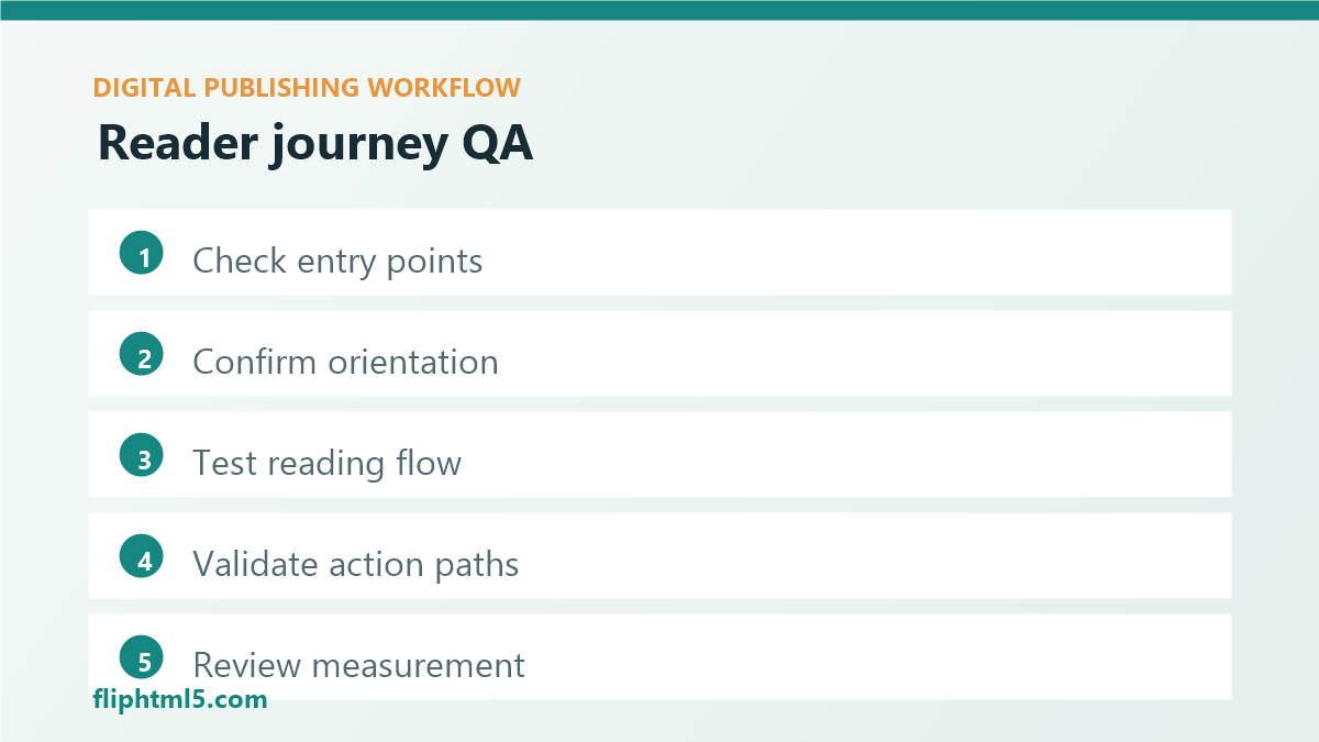
A practical workflow starts with five checks:
- Entry point: preview the search result, email card, social snippet, landing page, and embedded publication wherever possible.
- Orientation: confirm the title, intro, summary, table of contents, and visual hierarchy tell readers where they are.
- Reading flow: move through the edition on desktop and mobile, checking section order, spacing, captions, and media placement.
- Action path: test downloads, forms, related links, contact buttons, product links, and subscription prompts.
- Measurement: confirm analytics, UTM values, conversion events, and internal reporting names are consistent.
Test navigation and structure
Navigation is where many digital editions lose readers. The content may be strong, but if readers cannot scan, jump, return, or understand what comes next, they leave early. Review the table of contents, internal anchors, page labels, breadcrumbs, search behavior, and related-content modules.
For flipbooks and long-form resources, check whether section titles are meaningful outside the design layout. “Chapter 2” is weaker than “Choosing the Right Distribution Format.” Clear labels help readers move faster and make the edition more useful for sales, support, and internal teams.
Structure also includes metadata. The SEO title, slug, excerpt, open graph text, image alt text, and category choices should describe the same promise. When those elements drift, readers see one message before clicking and another after arriving.
Review mobile and accessibility
Mobile review should be treated as a required publishing step, not an optional preview. Check whether body text is readable without pinching, images retain important detail, tables can be scanned, buttons are easy to tap, and sticky elements do not block the content.
Accessibility review should cover text alternatives, heading order, link clarity, contrast, keyboard movement, captions for media, and reading order. If the edition includes a downloadable PDF or flipbook, test whether the surrounding page provides enough accessible context for readers who cannot use the visual layout in the same way.
Pre-publish reader checks
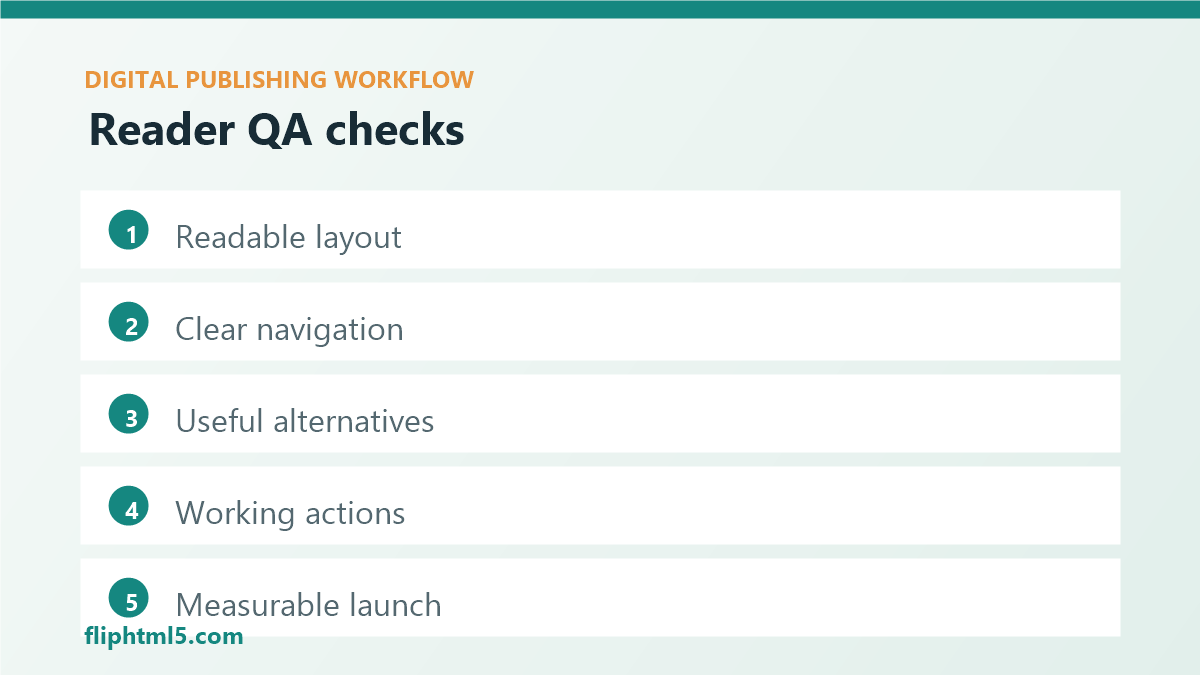
- Readable layout: body text, captions, tables, and pull quotes work on small screens.
- Clear navigation: readers can scan sections and return to important points.
- Useful alternatives: images and media include meaningful text context.
- Working actions: links, downloads, forms, and product paths behave as expected.
- Measurable launch: analytics and campaign parameters match the reporting plan.
Check trust and conversion paths
Reader trust depends on small signals. Dates, author names, source notes, product availability, pricing references, screenshots, and update notes should be current. If the edition includes AI-assisted content, licensed imagery, or reused excerpts, the team should know how those elements are reviewed and documented.
Conversion paths deserve the same attention. A call to action should match the reader’s stage. A first-time visitor may need a related guide, sample publication, or newsletter option before a sales form. A returning reader may be ready for a demo, quote request, or product comparison. QA should confirm that the next action feels helpful rather than abrupt.
Για ομάδες που συγκρίνουν ένα Πλατφόρμα Ψηφιακών Εκδόσεων ή Πλατφόρμα δημοσίευσης περιεχομένου, reader experience QA is especially useful because the same publication often supports web discovery, embedded reading, lead generation, and sales enablement.
Make QA repeatable
The easiest way to improve QA is to stop treating it as a heroic final pass. Build a tiered checklist instead. A short checklist can support routine articles. A deeper checklist can apply to high-traffic guides, catalogs, reports, and campaign pages. A launch-critical checklist can include stakeholder review, analytics validation, accessibility review, and post-publish monitoring.
Record recurring issues and fix them upstream. If captions are often too small, update the template. If social images are cropped badly, add a safe-zone rule. If campaign links are inconsistent, create a naming convention. QA becomes more valuable when every launch makes the next launch easier.
Συχνές ερωτήσεις
What is reader experience QA in digital publishing?
Reader experience QA is a pre-publish review that tests how readers find, open, navigate, read, trust, and act on a digital edition. It includes content, design, accessibility, links, metadata, analytics, and conversion checks.
How is reader experience QA different from proofreading?
Proofreading focuses on language accuracy. Reader experience QA reviews the complete journey, including layout, navigation, mobile behavior, accessibility, media context, tracking, and calls to action.
How often should publishers run reader experience QA?
Run a lightweight QA pass for every published edition and a deeper pass for high-value assets such as reports, catalogs, product guides, campaign landing pages, and evergreen content hubs.
συμπέρασμα
Reader experience QA helps digital publishers move beyond “the page is finished” toward “the journey works.” By testing entry points, navigation, mobile layout, accessibility, trust signals, action paths, and measurement before launch, teams can publish digital editions that feel clearer, more useful, and easier to act on.