Your digital catalog might look beautiful, but does it actually convert? In today’s competitive e-commerce landscape, a well-designed digital catalog can be the difference between browsers who leave and buyers who stay. The best catalogs don’t just display products — they guide visitors toward a purchase with intentional design choices.
Whether you’re creating a digital catalog from scratch or looking to optimize an existing one, these actionable design tips will help you turn casual viewers into paying customers.
1. Start With a Clear Visual Hierarchy
Visual hierarchy determines what your reader sees first, second, and third. Without it, even the most beautiful catalog feels chaotic. When visitors land on a page, their eyes need a clear path.
How to build effective hierarchy:
- Use size strategically — Hero product images should be 2-3 times larger than secondary ones. Larger elements naturally draw attention first.
- Leverage contrast — Place dark text on light backgrounds (or vice versa) for maximum readability. Your call-to-action buttons should use a contrasting color from the rest of the palette.
- Limit focal points — Each page or spread should have one primary focal point. If everything screams for attention, nothing gets noticed.
- Follow the Z-pattern — Western readers scan in a Z-shape. Place your most important elements along this natural eye path: top-left for brand/headline, top-right for key visual, bottom-left for supporting info, bottom-right for your CTA.
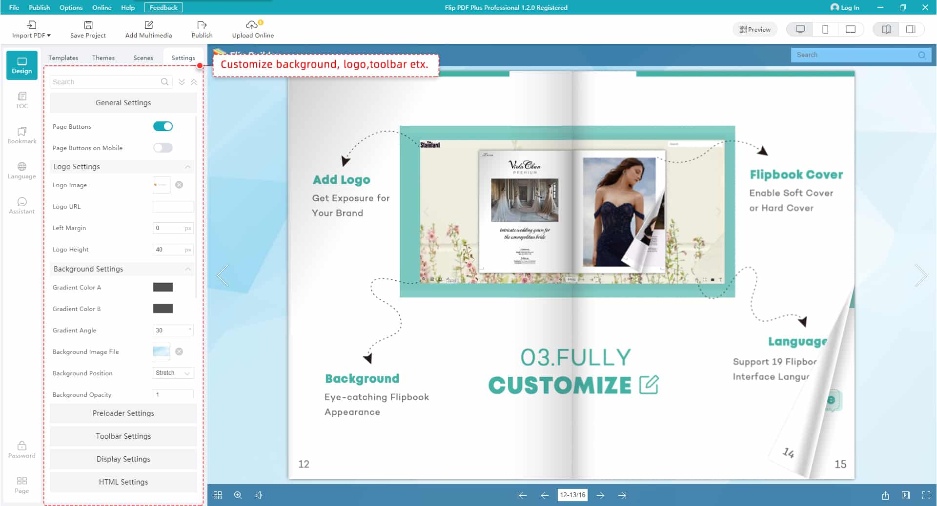
Tools like FlipHTML5 make it simple to set up professional layouts with built-in templates that already follow these hierarchy principles, so you don’t have to start from zero.
2. Optimize Product Photography for Conversions
Product images are the backbone of any catalog. Studies consistently show that high-quality product photography can increase conversion rates by 30% or more. But “high-quality” doesn’t just mean high resolution — it means intentional.
Product photography best practices:
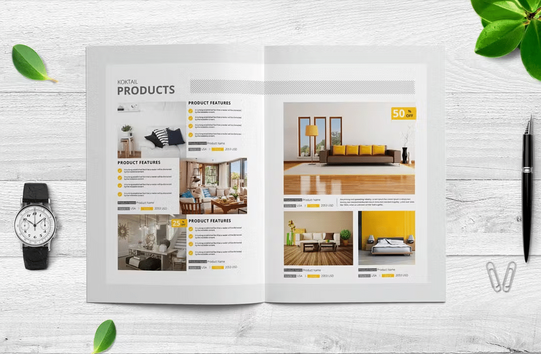
- Show products in context — Lifestyle shots help customers visualize ownership.
- Include multiple angles — Give viewers at least 3 perspectives: front, detail close-up, and in-use shot.
- Maintain consistency — Use the same lighting, background style, and image dimensions across your catalog.
- Optimize for fast loading — Compress images without sacrificing quality.
If you’re looking for inspiration, check out these digital catalog examples from brands that nail product photography.
3. Write Product Descriptions That Sell
Your product descriptions should do more than list specifications. They need to tell a story, address pain points, and create urgency. Great copy turns interest into action.
Conversion-focused copywriting tips:
- Lead with benefits, not features — “Keeps your coffee hot for 12 hours” beats “Double-walled stainless steel construction.”
- Use sensory language — Words like “silky,” “crisp,” “lightweight,” and “rich” help readers experience the product mentally.
- Add social proof — Include ratings, review snippets, or “bestseller” badges directly in your catalog layout.
- Create micro-urgency — Phrases like “Limited edition,” “Only 50 left,” or “New arrival” encourage immediate action.
- Keep it scannable — Use bullet points for specs and short paragraphs (2-3 sentences max) for descriptions.

4. Design CTAs That Actually Get Clicked
A call-to-action is where design meets revenue. Every page of your catalog should have a clear next step — whether it’s “Buy Now,” “Request a Quote,” “View Details,” or “Add to Cart.”
CTA design principles that drive clicks:
- Make them visually distinct — Your CTA buttons should stand out from everything else on the page.
- Use action-oriented language — “Get Your Free Sample” converts better than “Submit.”
- Place them at decision points — Position CTAs right after compelling product descriptions.
- Size matters — CTA buttons should be large enough to tap easily on mobile (at least 44×44 pixels).
- Add directional cues — Arrows, pointing images, or subtle whitespace can guide eyes toward your CTA.

5. Embrace White Space
White space — the empty area around your elements — is not wasted space. It’s a powerful design tool that increases comprehension by up to 20%.
How to use white space effectively:
- Give products room to breathe — Adequate spacing between items prevents the “flea market” effect.
- Use margins strategically — Wider margins signal luxury; tighter margins signal value/volume.
- Separate sections clearly — Use generous spacing between catalog sections rather than heavy borders.
- Balance text and images — A good rule: 30-40% of any spread should be white space.
6. Make Navigation Intuitive
Even the best-designed catalog fails if readers can’t find what they want. Navigation is especially critical for digital catalogs.
Navigation best practices:
- Include a clickable table of contents — Let readers jump directly to product categories.
- Add category tabs or bookmarks — Visual markers help readers orient themselves.
- Implement search functionality — For catalogs with 20+ products, a search bar is essential.
- Use breadcrumbs — Show readers where they are in the catalog.
- Keep page counts reasonable — Catalogs under 50 pages get 60% higher completion rates.

7. Optimize for Mobile Viewers
Over 60% of digital catalog views happen on mobile devices. If your catalog isn’t mobile-optimized, you’re losing the majority of your potential conversions.
Mobile optimization checklist:
- Use responsive layouts — Your catalog should automatically adapt to screen size.
- Increase font sizes — Body text should be at least 14px on mobile.
- Stack layouts vertically — Two-column grids should convert to single-column on mobile.
- Make buttons thumb-friendly — Add padding around interactive elements.
- Test page load speed — Compress images aggressively and use lazy loading.
8. Use Color Psychology to Drive Purchases
Research shows that 85% of consumers cite color as the primary reason they buy a product. Here’s how to use it strategically:
- Red creates urgency — Use for sale prices, limited-time offers. But use sparingly.
- Blue builds trust — Ideal for B2B catalogs, technology products.
- Green signals value and sustainability — Perfect for eco-friendly product lines.
- Black conveys luxury — High-end brands use dark backgrounds with minimal color.
- Orange drives action — One of the best colors for CTA buttons.
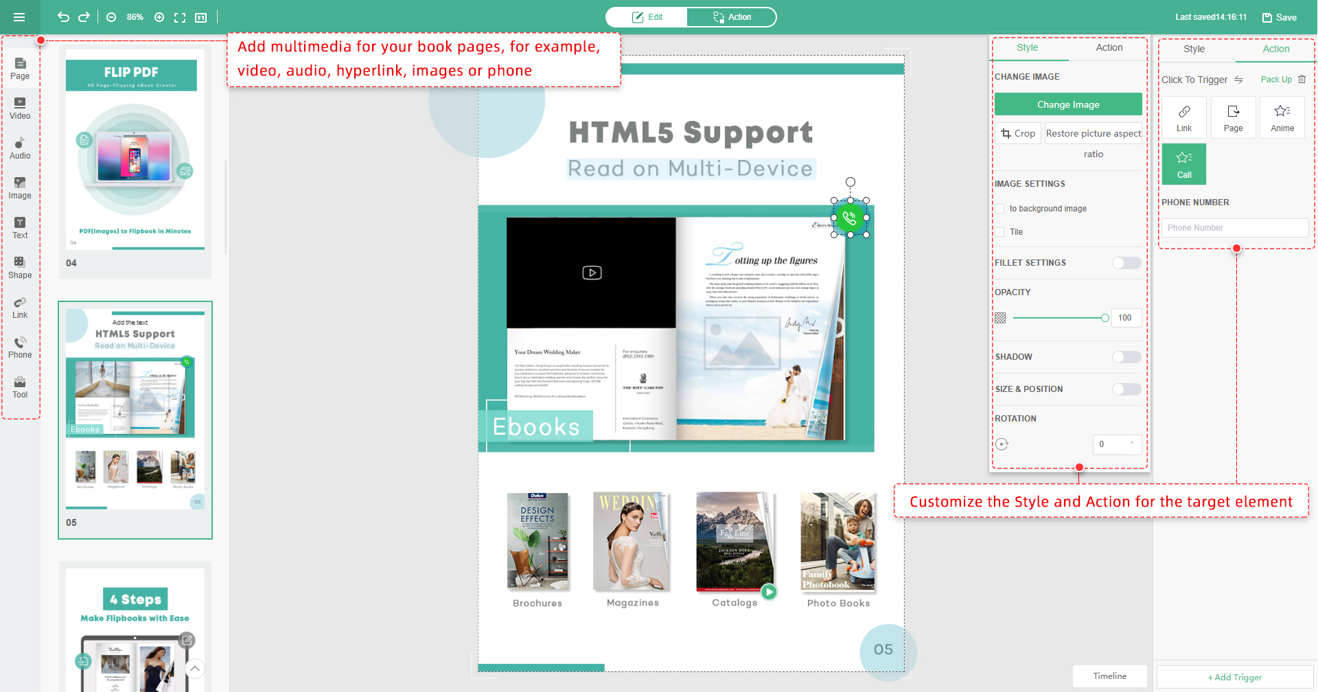
9. Add Interactive Elements
Interactive features keep readers engaged 3x longer and drive significantly higher conversion rates.
High-impact interactive elements:
- Embedded videos — Product demonstration videos can increase purchase intent by 73%.
- Hotspot links — Clickable areas that link directly to product pages or shopping carts.
- Image galleries and zoom — Let readers explore product details without leaving.
- Animated transitions — Subtle page-flip animations make browsing feel premium.
- Embedded forms — For B2B catalogs, embed quote request forms directly.
10. Test, Measure, and Iterate
Continuously monitor your catalog’s performance and make data-driven improvements over time.
FlipBuilder provides built-in analytics so you can track how readers interact with your catalog and identify opportunities for optimization.