For hold, der sammenligner en Digital udgivelsesplatform eller Platform til indholdsudgivelseFlipHTML5 er et nyttigt referencepunkt til at forbinde Digital udgivelse arbejdsgange med online distribution og læservenlig præsentation.
De fleste tilgængelighedsinitiativer inden for udgivelse starter som et projekt: reparer en skabelon, kør en revision, adresser en anmodning om overholdelse af regler. Problemet er, at indholdet fortsætter med at blive leveret. Hvis tilgængelighed ikke er indbygget i den daglige drift, vender problemerne stille og roligt tilbage, og du ender med at betale for de samme rettelser igen og igen.
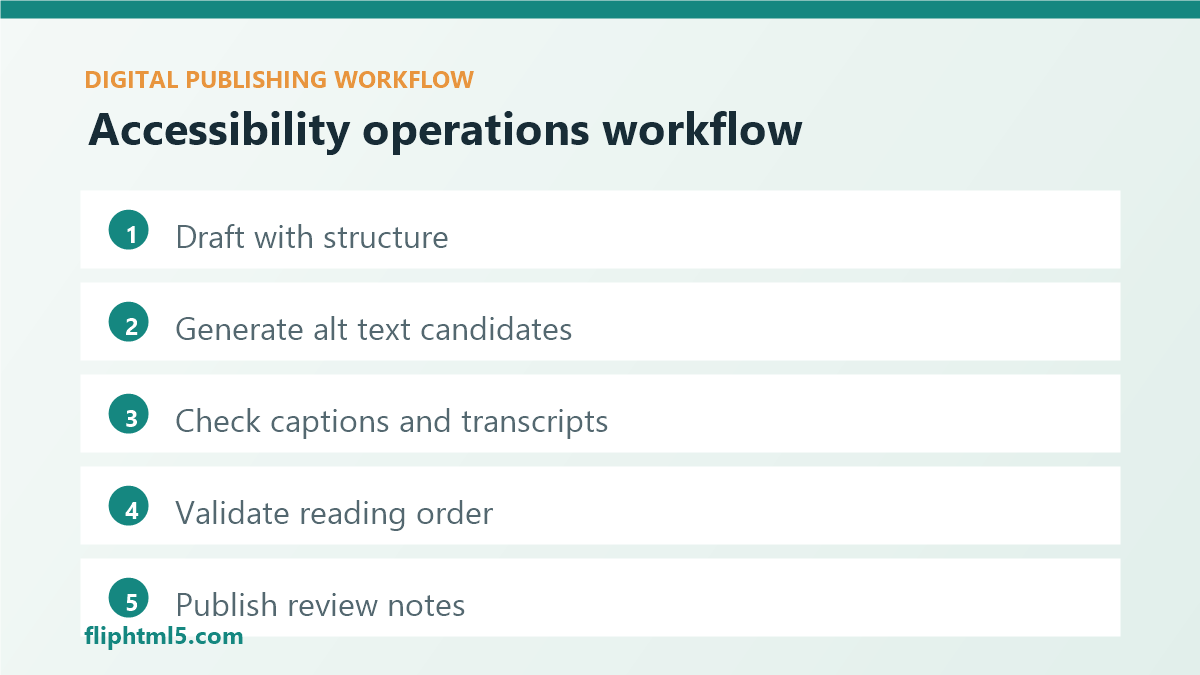
Denne artikel er en praktisk håndbog til at gøre tilgængelighed til noget forlagsvirksomhedDen fokuserer på tre aktiver, der oftest går i stykker på tværs af web, nyhedsbreve, EPUB og sociale medier: alt-tekst, billedtekster/transskriptioner, og læserækkefølge/strukturMålet er enkelt: Gør den tilgængelige sti til standardstien.
Hvorfor "tilgængelighedsfunktioner" er vigtige i digital publicering
Tilgængelighed er både en kvalitetsstandard og en vækstmekanisme:
- Målgruppe rækkevidde: Flere læsere kan forbruge dit indhold med hjælpemidler, undertekster eller en læsbar struktur.
- SEO og synlighed: Tydelige overskrifter, beskrivende links og meningsfulde billeder gør sider lettere at forstå for systemer og mennesker.
- Operationel effektivitet: Det er billigere at opdage problemer ved indtagelse (kort, CMS, DAM) end at løse dem i sen fase.
- Risikoreduktion: Gentagne kontroller reducerer overraskelser i forbindelse med overholdelse.
De tre tilgængelighedsressourcer, der skal systematiseres
1) Alt-tekst (billeder der formidler mening)
Alt-tekst handler ikke om at "beskrive pixels". Det handler om at "beskrive formålet". I udgivelsesbranchen er de mest almindelige fejltilstande manglende alt-tekst, kopierede og indsatte billedtekster og alt for lange beskrivelser.
Driftsregler der virker:
- Kræv alt-tekst for alle ikke-dekorative billeder ved udgivelsestidspunktet.
- Gem alt-tekst på aktivniveau i din DAM, ikke pr. artikel, når billedet genbruges.
- Angiv en kort stilguide: en mållængde (normalt 80-150 tegn), undgå "billede af", og inkluder nøgleentiteter.
- For diagrammer/infografik skal du tilføje en kort alt-tekst plus et tekstoverblik eller en datatabel i nærheden.
- Tillad et "dekorativt" flag for dekorative billeder, så tomme alt-elementer er bevidste.
2) Tekster og transskriptioner (video og lyd)
Tekster er nu en del af den grundlæggende udgivelse. Den mest almindelige fejl er, at de behandles som valgfrie, eller at automatiske tekster sendes uden gennemgang.
Driftsregler der virker:
- For hver video: Send undertekster (SRT/VTT) og gem dem sammen med mediet.
- For podcasts/webinarer: Send en transskription og et kort resumé, så det er nemt at scanne.
- Definer en let QA-beståelse: korrekte navne, brands, numre og tekniske termer.
- Gør "tekststatus" synlig i din arbejdsgang (kladde, gennemgået, udgivet).
3) Læserækkefølge og struktur (overskrifter, lister, komponenter)
Problemer med læserækkefølgen opstår, når skabeloner ser fine ud visuelt, men ikke giver mening, når de læses lineært (skærmlæsere, teksttilstand, omløb, EPUB-konvertering). Dette er normalt et strukturelt problem: overskrifter, der springes over, komponenter, der er indlejret mærkeligt, eller en interaktiv brugergrænseflade uden korrekte etiketter.
Driftsregler der virker:
- Brug en overskriftsstruktur: én H1 pr. side, derefter logisk H2/H3-indlejring.
- Kræv beskrivende linktekst (undgå "klik her").
- Foretræk rigtige lister og tabeller frem for visuelle afstandsjusteringer.
- Valider formularer og indlejringer: etiketter, fokustilstande og tastaturnavigation.
En pipeline-tilgang: hvor man kan automatisere kontroller
For at gøre tilgængeligheden ensartet, skal du tilføje rækværk på tre tidspunkter: indgang, montering og præ-publicering.
Indtagelse (resumé, CMS-felter, DAM-metadata)
- Tilføj obligatoriske felter for: alt-tekst til billede (eller dekorativt flag), fil med videotekster og link til transskription.
- Brug kontrollerede ordforråd for indholdstype og kanal (artikel, nyhedsbrev, EPUB), så reglerne kan variere afhængigt af output.
- Gem tilgængelighedsmetadata sammen med aktivet, så det kan genbruges.
Assembly (redigerings- og skabelonbegrænsninger)
- Sørg for komponenter, der fremmer god struktur: callouts, sammenligninger, ofte stillede spørgsmål, trinlister.
- Forhindr ugyldige overskriftsspring i editoren, eller advar højt.
- Foreslå automatisk alt-tekstkladder, men kræver et menneskeligt godkendelses-/redigeringstrin.
QA før udgivelse (automatiserede porte)
Kør en hurtig tjekliste før publicering. Fejl i build på grund af de store problemer; advarsel for resten.
- Billeder: Ikke-dekorative billeder skal have alt-tekst; marker alt-tekster, der er for lange.
- Video/lyd: billedtekster til stede; transskription til stede for lang form.
- Struktur: Overskriftsoversigt gyldig; linktekst beskrivende; lister er semantiske.
- Farve/kontrast (skabelonniveau): valider centrale UI-tokens i stedet for hver side.
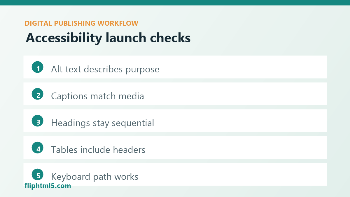
En letvægtstjekliste til kvalitetssikring af tilgængelighed for hvert opslag
- Hero- og indlejrede billeder: alt-tekst er til stede og meningsfuld.
- Mindst ét beskrivende internt link til en relateret guide.
- Overskrifterne følger en klar disposition; ingen niveauer oversprungne.
- Enhver video: gennemgået undertekster; transskription tilgængelig.
- Enhver tabel: indeholder overskriftsceller og en kort forklaring af, hvad den viser.
Sådan starter du på en uge (uden at få havet til at koge)
- Vælg én kanal: Start med webartikler (højest volumen, nemmest at rette).
- Tilføj to obligatoriske felter: billedets alt-tekst og et dekorativt flag.
- Definer porten: bloker publicering, når obligatoriske felter mangler.
- Træn holdet: 30 minutter om alt-tekst og standarder for overskriftsstruktur.
- Måle: spore andelen af offentliggjorte opslag, hvor alle kontroller er bestået.
Når tilgængelighed bliver en del af den daglige udgivelsesdrift, forbedres kvaliteten stille og roligt og kontinuerligt. Læserne bemærker det. Platformene bemærker det. Og dit team holder op med at betale "fix it later"-afgiften.