Color plays a significant role in everyday life, business, the arts, and so on. Your clothing color may reveal a lot about your personality, and your brand logo color can somehow convey the concept of your company. The power of color should not be underestimated.
How should we talk about colors?
Blue is the sky, green is the grass, and red is the apple. This is how we might describe the color. But have you ever considered what aspects of color should we start from if we want to describe the color in detail?
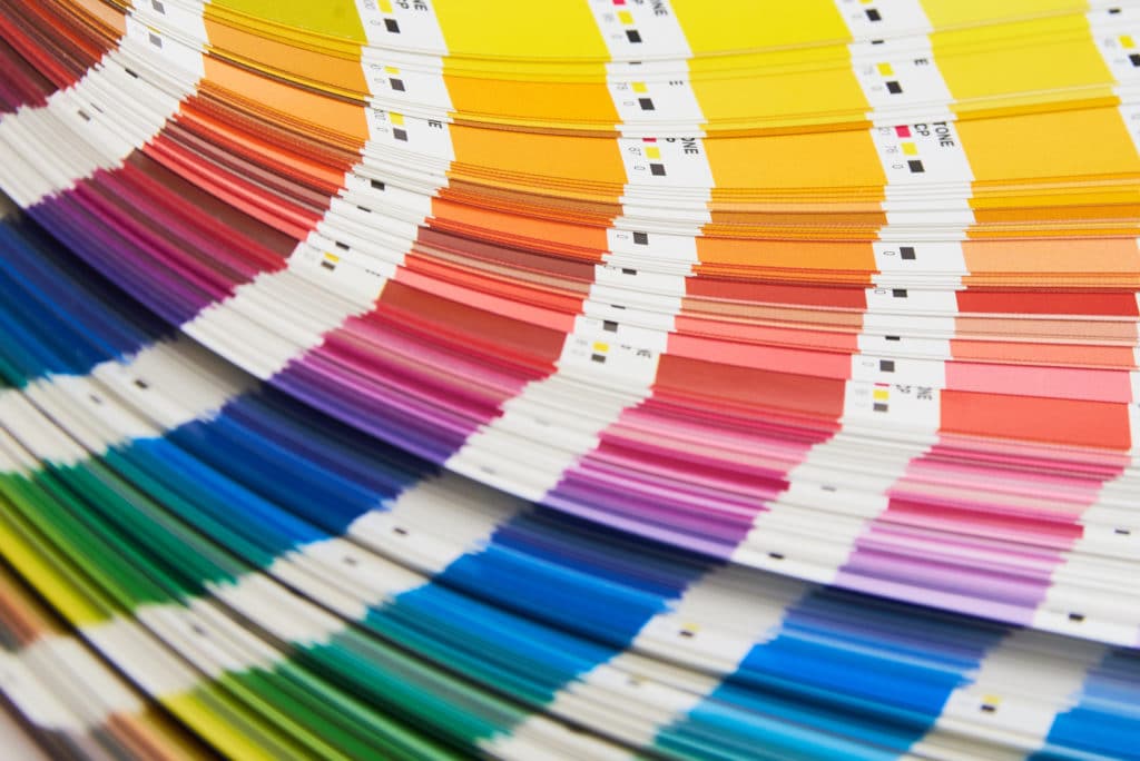
Color has three basic characteristics: hue, chroma (saturation), and value (lightness). They are also known in color science as the three elements of color or the three attributes of color. If you want to discuss color, you can start with these three characteristics.
Hue: Hue refers to the origin of the color we see.
Chroma: Chroma is the purity of a color.
Value: Value refers to the lightness or darkness of a color.
What is color psychology and how does it impact our lives?
Color psychology is the study of the effects of color on human emotions, behaviors, and feelings. “Colors, like features, follow the changes of the emotions.” the artist Pablo Picasso once remarked. Color’s role is not only to decorate an object, but also to influence a person’s mood. Color psychology has been used for centuries in many fields, including marketing and branding.
How will color affect our flipbooks?
The color of the flipbook is the first thing readers will notice before reading the content. One of the most important factors in catching readers’ attention is the color of a flipbook. Understanding the emotional qualities of different colors and mastering their use in flip book design can help readers become more engaged.
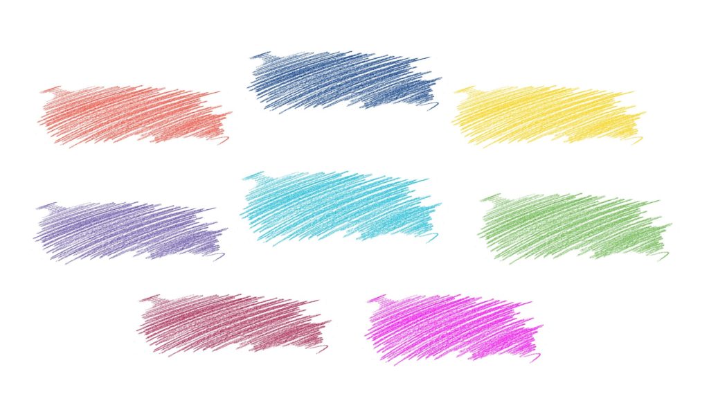
Here are some of the emotional qualities of colors:
Red: Red is one of the three primary colors. It is the most noticeable and alerting color, but it can also elicit a tense and oppressive mood. The color red communicates a sense of urgency and speed. As a result, fast food companies such as Burger King, McDonald’s, and KFC frequently use red in their branding. Red can be used to highlight content, special offers, or tips and notes in a flipbook. It is not recommended to use red on large areas of PDF or flipbook interface.
Green: Green is always regarded as a positive color. It is commonly associated with nature, peace, and environmental protection. Green is one of the secondary colors. According to some studies, people are most relaxed when they see the color green. It’s a never-go-wrong color.
*secondary colors: these are color combinations created by the equal mixture of two primary colors.
Orange: Orange represents confidence, energy, and bravery. Orange is the warmest of all the colors. It exudes vitality and vibrancy. At the same time, the color orange can increase appetite. If you want to make a food-related flipbook, orange is a good color to use.
Yellow: Yellow is vigorous. It also signifies brightness and harvest. Too much yellow on a page, on the other hand, will cause visual fatigue, which is why we do not recommend using too much yellow in the design of flipbooks.
Blue: Blue represents logic and royalty. It’s a very popular color that we see almost everywhere. It instills authority and trust. Blue or white is commonly used as the primary color on many official documents. Blue can also evoke feelings of technology. Many technology products and web pages, you may have noticed, make extensive use of blue.
Black: The color black is symbolic of seriousness, mystery, power, and sadness. It is the opposite color of white and is also known as the absence of color. You can use black if you are preparing materials for serious topics.
White: White is pure, innocent, and clean. Some may regard white as meaningless, but white can be powerful. G.K. Chesterton, an English writer, once said white is not a mere absence of color; it is a shining and affirmative thing, as fierce as red, as definite as black. God paints in many colors, but he never paints so gorgeously. White is a color that can’t go wrong. White can help other colors stand out, but it is also a good choice for the main color.
Purple: The color purple is associated with royalty and ambition. Bright purple gives a light and calm impression while dark purple may let you feel mysterious.
Gray: It is an intermediate color between black and white. Gray is a color that is neutral but stable and can be easily combined with other colors. Gray is also a popular color in many design catalogs because it is both modern and classic. It contrasts well against a lot of colors.
How can we color our flipbooks?
Apart from the design of the original PDF, there are some related features in the program that could help us color flipbooks.
Here are some common color settings in the program:
- Toolbar color
- Button color

- background color
In addition to a single color for the background, we can create a gradient effect by selecting two colors. Setting the gradient colors will create a three-dimensional color, making our book look more versatile and vibrant.

- Toolbar opacity
- background opacity
We are able to change the toolbar or background opacity value (0.1-1) to achieve the goal of highlighting or weakening the color in the layout of your flipbook.

Besides these basic settings, in Flip PDF Plus Corporate, it would be a good idea for us to use the built-in materials in the multimedia editor to enhance the content and color of the flipbook.
- Text color
We are able to add text with the multimedia editor, and the text color is changeable. Select a text color according to the topic of the content or the image color.
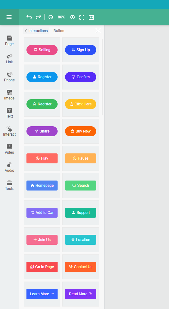
- Button color
In Flip PDF Plus Corporate, adding buttons to the flipbook is available. Link to a website in the button, and change the color/icon.
- Hotspot color
As mentioned above, the color red could express a warning or reminder. Hotspots in the editor can be easily noticed by people since they have a dynamic effect. We are able to combine the hotspot feature with prominent colors to achieve the optimal visual effect.

Find the best color and create your flipbooks!
Choose the most suitable colors for your content and use them to color your flipbook. We hope the information above has inspired you a little bit in making your flipbooks.